Color, Paint, and Present-Day Painting (1966)
Artforum, Vol. 4, (April 1966) pp. 35 - 37.
In recent years much attention has been given to color in painting. More paintings with a broad range and deliberate use of strong color are being shown now than four or five years ago. Painters who set up color problems in their paintings are considered avant-garde; they are often referred to as "color painters" or "color-field painters." Pop and optical artists, who use color less as content than the so-called color painters do, nevertheless lean heavily on color to help provide the effects of identification, shock and illusion, and some of them actually use a broader range of colors than the color painters.1 The use of color as I have seen it in paintings done within the last four or five years is the motivation for and in part the subject of this article.
Like anything that can be made visible on a canvas, color is a painter's tool. A tool is better as it becomes more complex and flexible. If paintings are going to be made which push color forward to be seen for itself, or contrive it as content, then I feel that the painters doing them should have some knowledge of color theory, and more important, easy access to any color in a quickly usable form.
This seems simple. A painter reading this may feel that there is no problem, that many of the new, versatile polymer emulsion artist's paints can be had in "all colors": red, orange, yellow, blue, green and so on, even in some variations of these colors. However, the untrained human eye (so I am told) is able to perceive three million degrees of color difference. I do not know if I could, but I know I can distinguish thousands, and so can most people, especially painters. To the best of my knowledge no art paint company offers more than 100 discrete colors. In fact, I know of only one or two in the 50-color range, and they are the traditional tube paints.
Theoretically, any color can be mixed from the primaries, with black and white, but that is a lot of trouble; it's expensive, and matching colors is very tedious, and unless you are good at it, very frustrating. The result is that most painters, including color painters, use the colors much as they come from the jar, sometimes thinned, with perhaps a mix or two or some black and white added. Most paintings I have seen contain the same 30 or 40 colors. In effect, therefore, the color range of the artist is set by the company from which he buys his paints.
Our attitude toward paint is a hangover from Abstract Expressionism.2 Most Abstract Expressionist painters used color as an "ax," to cut one area from another, and to identify planes and relationships. No complexity of color is needed for this. They had what they needed: a respectable range of distinct strong colors in an easy-to-handle form, and that is exactly what the art-paint manufacturers offer the painter today. Of course a great painting can be made from one or two colors, and there can be no proof that painters need a sophisticated color system to paint beautiful paintings. But I feel that if painters had more colors they would use more colors, and that a more complex and varied spectrum would appear in contemporary painting.
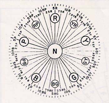
Most people have seen a simple color wheel. Figure (1) is a somewhat complicated color wheel, but it is easy enough to understand if you read the caption and realize that "R" means red and "Y" yellow and so on. The colors you imagine on that wheel are probably full saturation colors, strong colors, like you get in a small watercolor box. The usual terms for colors, red, yellow, blue, are technically hue names. Hue is one of the specific attributes of color, the other two being:
Value, which is the degree of lightness or darkness of a color, and
Chroma, the degree of saturation of a color - the extent to which a color departs from a grey the same value toward the full strength of its particular hue.
Any color can be accurately described by employing the three coordinates -- hue, value and chroma.3
Some years ago A. H. Munsell, of the Munsell Color Company in Baltimore, completely systematized color description. Some of the books and monographs in my bibliography describe this system and its many uses in detail. I will explain it briefly; it's a handy way to visualize color relationships.
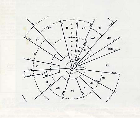
Suppose we take the color wheel in Fig. (1), and extend it to make a cylinder, and mark off the extension in degrees from 0 to 10 according to value - 0 for black and 10 for white. A dissection of the cylinder might look like Fig. (2). We already have a 10-section division of the color wheel shown in Fig. (1), a division of hue. Chroma is measured from the grey core and proceeds out toward the circumference of the cylinder to its maximum, which varies cording to hue. I believe chroma numbers go up 16 or so. Chroma is the only coordinate which is not limited at both ends, by definition. The result is that we have a cylinder containing all possible colors in a continuously variable form. Any color has a place in the cylinder, and each place, or color, can be described by means of the three coordinates. A horizontal slice, roughly through the middle of the cylinder, looks like Fig. (3). Properly filled in, each color of this wheel would be of the same value and differing hue and chroma; a black and white photograph should turn out a uniform grey, and that grey should have a value of about 5, since we took a slice midway through the value scale.
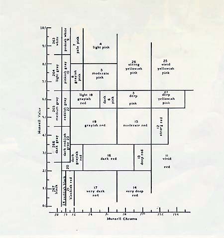
A typical vertical slice, from axis to circumference, as shown in Fig. (4), contains the variations of a single hue, in this case a "straight" red, 5R on the color wheel shown in Fig. (1). Value and chroma will vary in this sample, but all parts will contain at least some of the hue red.
With this system, and with the proper equipment for matching colors against standardized color samples, we can write a formula for any color. The Munsell formula is HV/C, or HUE VALUE/CHROMA. For example, a strong red might be identified as 5R 5/12, which means:
5R - Dead center on red on the hue wheel.
5 - Roughly between black and white in value, halfway up or down the axis of the cylinder, equal in value to a neutral grey. This does not mean that the color has any grey in it, just that a black and white photograph would show no difference between the red and a #5 grey.
12 - Very strong chroma, or saturation, far out from the grey axis toward the fully saturated circumference. Chroma is the most difficult color co-ordinate to imagine; it means strength, intensity and vividness.
Though I recommend reading on the subject, it is not likely that any painter will want to apply the Munsell system directly to his painting. "Color symphonies" of some sort might be composed, using the color coordinates in a programmed system, with some sort of instant color production, but that is not my concern here. For me, the "color solid," as it is called, is simply a convenient and helpful method for particularizing and identifying color. It is a good way to think about colors, and it helps color recognition and color memory. With a little practice, and after browsing through a few color sample books, it is possible to think of any specific color in terms of the color coordinates, and realize that the "yellow" you may be looking at actually contains, besides yellow, white, black and green.
I began making paintings with large areas of contrasting color in 1957, before the jar colors were widely available, and I found that lighter, or "pastel" colors had a wider range than deep colors, and were therefore more suited to what I wanted to paint.4 It seemed to me at that time that the cheapest and easiest way to get a good pastel color was to mix the paint from a tube of artist's color with a standard white house paint. By varying the amounts of pigment, and by using black, I was able to get a wide range of colors which satisfied my needs. The only real problem was storage. If I wanted to use one of my mixes again I had to get a can, and the can had to fit the amount of paint I had left over, so that there would be not too much air left in it to dry out the paint. I could have matched the color, but matching, as I have said before, is troublesome. Soon I had a lot of paints in various-sized cans and jars, with improvised and inadequate identification, and the paints kept drying and forming films and separating.
Then I noticed that the hardware store from which I bought my white paint had a large range of "decorator" colors in quart cans and a color chart to go with them. Also I found that it was possible to select from a bank of about 200 color chips any color, which would be mixed by the paint salesman. He would use a can of base vehicle and pigment from tubes mixed according to the formula printed on the chip. These cans of paint supplanted my "mix and match" system, and I used them for several years.
Around 1960 many of the large paint companies introduced paint mixing machines which could mix virtually any color in any amount quickly, easily and cheaply, thereby offering decorators and do-it-yourselfers an extremely sophisticated system of color selection, more complex than that of any art paint company.
Most of my paints are made by the Dutch Boy subsidiary of National Lead Company. Their system is similar to most others (but their color book is superior) and I will use it as an example because I am most familiar with it.
Dutch Boy gives two books to the local paint store. One is called "The Spectral Range" - that is the color sample book. The other is the formula book, containing the recipes for the colors shown in the color sample book.
The color sample book, with a pretty good discussion of color as a preface, has about 2200 color chips mounted 60 to a page, arranged in 10 sections, beginning with "pure bright colors" and ranging to "greyed colors," "off whites" and "deep colors." If properly rearranged these colors would provide a balanced filling of the color solid described above.
The mixing machine is a circular arrangement of 12 three-by-five inch tubes, each with a pump, valve and gauge, each containing a different color of pigment.
I might choose from the color sample book a moderately bright bluish green: 28/13. In the formula book the recipe reads as follows:
28/13 LIGHT BASE
| Quarts: | Gallons: |
|---|---|
| G 12 | G 1 oz. |
| H6 | H 24 |
| J4 | J16 |
The salesman takes, let's say, a quart of Dutch Boy flat alkyd light base vehicle,5 and puts in 12 units from the G (yellow-green) tube, 6 units from the H (blue-green) tube and 4 units from the J (reddish-black) tube. Then he screws the can into another machine to shake it up and in a few minutes I have a large quantity of paint in a neat, easy-to-use form for a little over $2.00.
These paints are apparently best suited for a painter who wants large, even, flat areas of color. That is what they are designed to provide. However, I would recommend them for all painters, excluding only those who use paint in a textural manner, because of the qualities of color range and ease of use I have described. For $125.00 or less it is possible to buy a "basic library" of 50 of the saturated colors with quite a few variations. If a certain deep red is not in the color sample book, two or three ounces of the basic red pigment can be added to a can of deep or medium vehicle, with good results. This basic collection can grow according to one's inclination and pocketbook, adding tints, shades and close-value variants of colors one already has. I have about 600 quarts now, bought at intervals within the last six years, and although I depend heavily on shades and close values I am seldom stuck for a color. If I am, I just estimate what I need from one of the color sample books I have, call the paint store and order the color.
It is not necessary that a painter who is strongly concerned with color, or depends on color or color effects, must have a large range of subtly differentiated colors at his fingertips. But I feel that many painters would like a fuller, more accessible color range than they now have, and would be happier with the selection offered by the large paint companies which supply house painters and decorators.
Footnotes
1. One reason for this is that Color painters usually display a specific number of flat, clearly delineated colors, while a Pop artist may copy a color photograph, advertisement or realistic scene, and have to use shading and deliberate color approximation which will raise the color range of a particular picture. Of course, in itself this has nothing to do with quality.
2. So is our attitude toward format, which is a reaction to Abstract Expressionism. It is hard to get away from. I feel that the present method of layout for most color painters - flat areas, hard edges, often symmetry - is "putting the cover on" the Abstract Expressionist method of doing things, which most thoughtful painters today feel is severely limited. Color is a natural consequence of this reaction, because there are large flat areas to fill. But if and when we can become familiar enough with color to attack the canvas from the standpoint of color instead of space I believe this strictness will dissolve. If color determines style we will probably have no more lines and planes in our paintings than are found in nature.
3. There are two other descriptive terms for color which although not color co-ordinates, are very helpful - tint and shade. These terms are used relative to a particular color and not absolutely, such as a tint of (tint "from" actually) greenish yellow, or a shade of (from) pink. A tint is produced by adding white, thereby lightening a color. A shade is produced by adding black, and thereby greying or suppressing a color.
4. Colors are less visually discrete as they approach black. I suppose this is simply because they are then less available to be seen, like objects in a dark room. Consequently, from a pragmatic standpoint, there are fewer colors on the black than on the white end of the cylinder axis (value scale), and I like to think of the color solid as a bow-shape or hemisphere.
5. There are many choices to make. I use quarts because a quart covers a huge area, and they are cheaper and more convenient than gallons. The paints can be had in flat semi-gloss and high-gloss; there is quite a difference, enough so that I often use a flat and a gloss of the same color adjoining on the same painting, and because of the varying reflectance they are quite distinguishable. The vehicle, or base, is either alkyd resin or latex. I use alkyd resin for a number of reasons. I think it has a better appearance, a better "feel," in use, and it dries slower, which is important if you want an even toned surface. It also seems cleaner and more convenient. The choice of base is probably quite personal however. The vehicle also comes in light, medium and deep tones. The choice is made according to the value desired; it is made for you if you mix from one of the recipes, but if you want to make up you own colors this value choice is an important one. Finally the paint has to be thinned. If it is latex you use water. If it is alkyd you can use a variety of solvents. I prefer the simplest - mineral spirits - because it leaves no residue. Paints have to be thinned carefully to get the finish you want. If they are used unthinned they are difficult to work with, and dry unevenly.
Bibliography
1. Evans, Ralph M., An Introduction to Color. John Wiley & Sons, N. Y.
2. Jacobson, E., "Color Harmony Manual." Container Corp. of America, Chicago, Illinois.
3. Kelly, Kenneth L., "Coordinated Color Identifications for Industry." U.S. Dept. of Commerce, National Bureau of Standards Technical Note 152, November 1962. Superintendent of Documents, Washington, D.C.
4. Maerz, A., and Paul, M. Rea, "A Dictionary of Color Names." McGraw-Hill Book Co.
5. McAdory. Margaret, "Color in Painting." Munsell Color Co.. Baltimore. Md.
6. Munsell, A. H., "A Color Notation." Munsell Color Co.. Baltimore, Md.
7. "The Munsell Book of Color," Pocket Edition, 1960. Munsell Color Co.. Baltimore, Md.
8. National Lead Co. "Dutch Boy Color Gallery, the Spectral Range." Color Sample Book.
9. Optical Society of America, Committee on Colorimetry, "The Science of Color." Thomas Y. Crowell. N.Y., 1953.
10. U.S. Dept. of Commerce, "The ISCC-NBS Method Of Designating Colors and a Dictionary of Color Names." National Bureau of Standards Circular 553. Superintendent of Documents, Washington, D.C.
[end]